
Heatmaps are powerful visualization tools that help us identify relationships and patterns in data through color coordination. In this guide, we will explore how to create heatmaps in Tableau and the various ways they can be utilized to enhance data analysis.
Understanding Heatmaps
Heatmaps offer a visual representation of data where values are depicted by colors. This method allows for quick identification of areas with high and low values, aiding in the analysis of trends and relationships. They are particularly useful when dealing with large datasets where traditional methods may fall short.
Creating Your First Heatmap in Tableau
To create a heatmap in Tableau, start by following these simple steps. Let’s say we want to analyze sales data across different categories and regions.
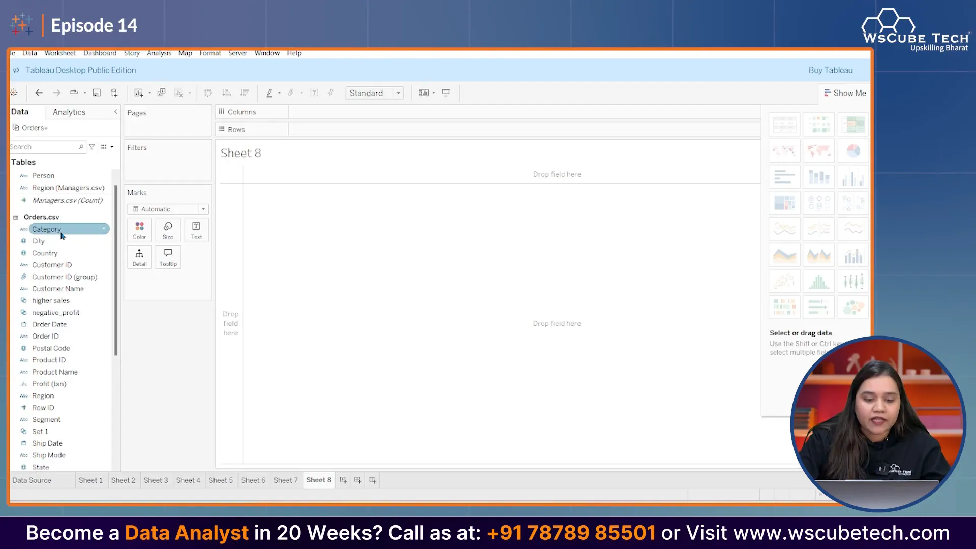
Step 1: Set Up Your Data
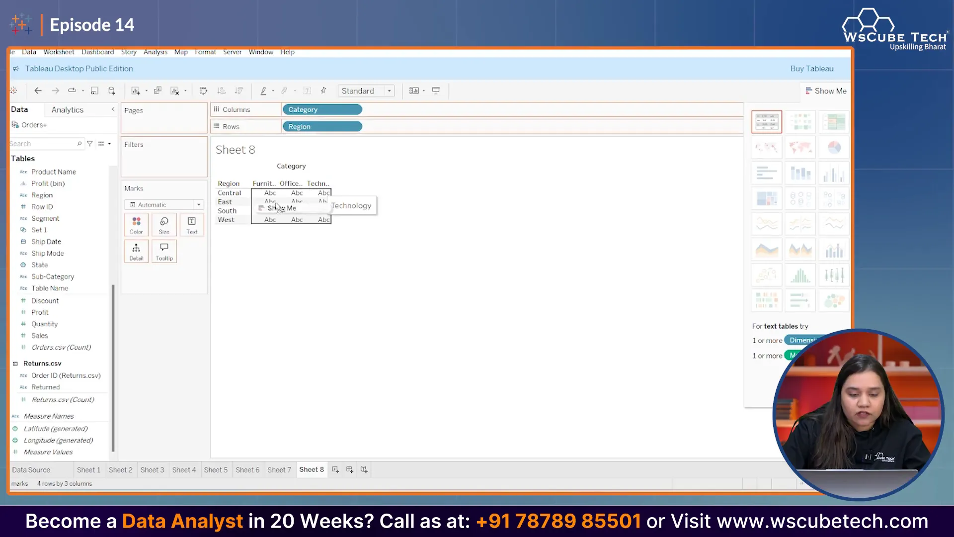
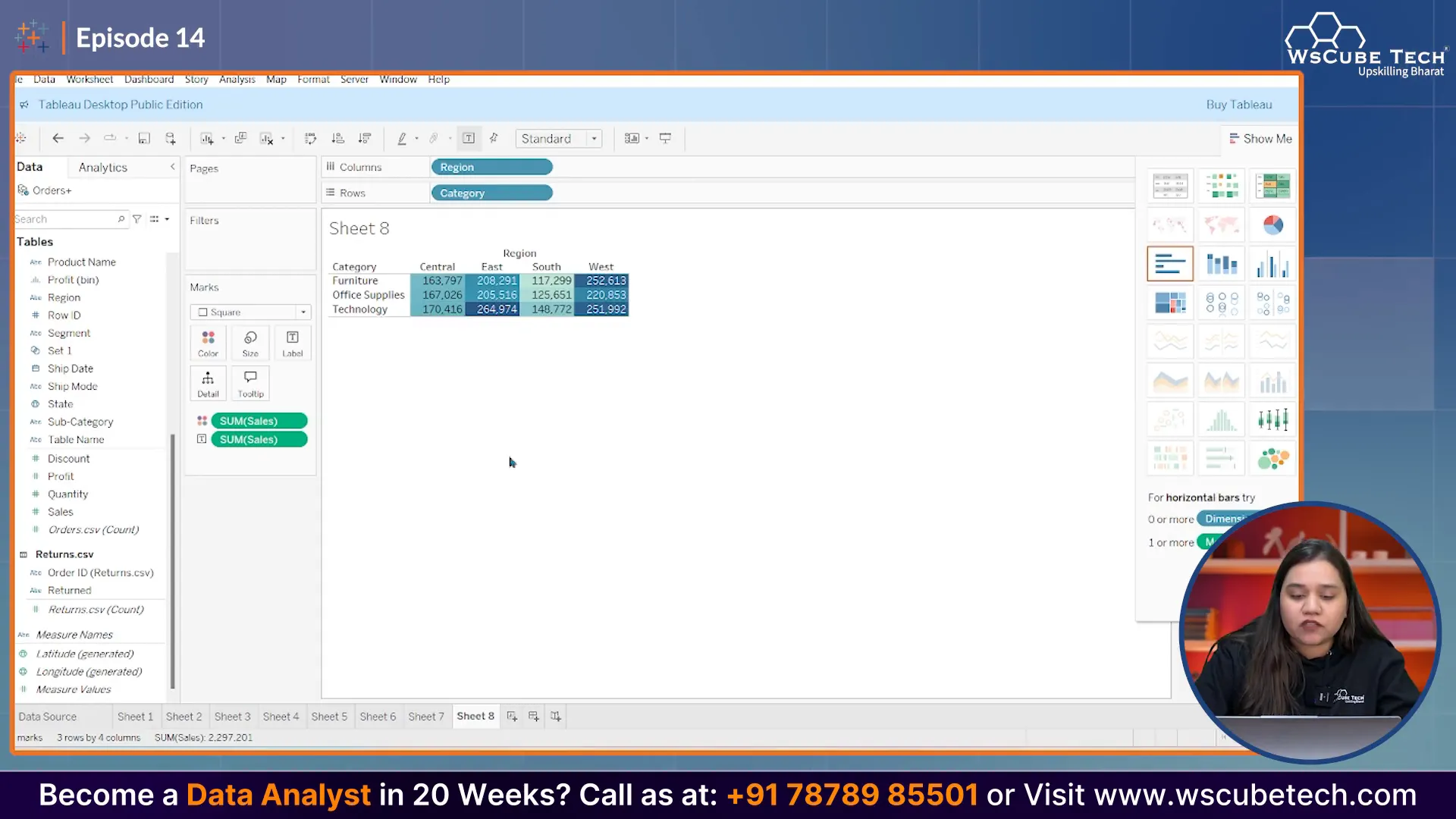
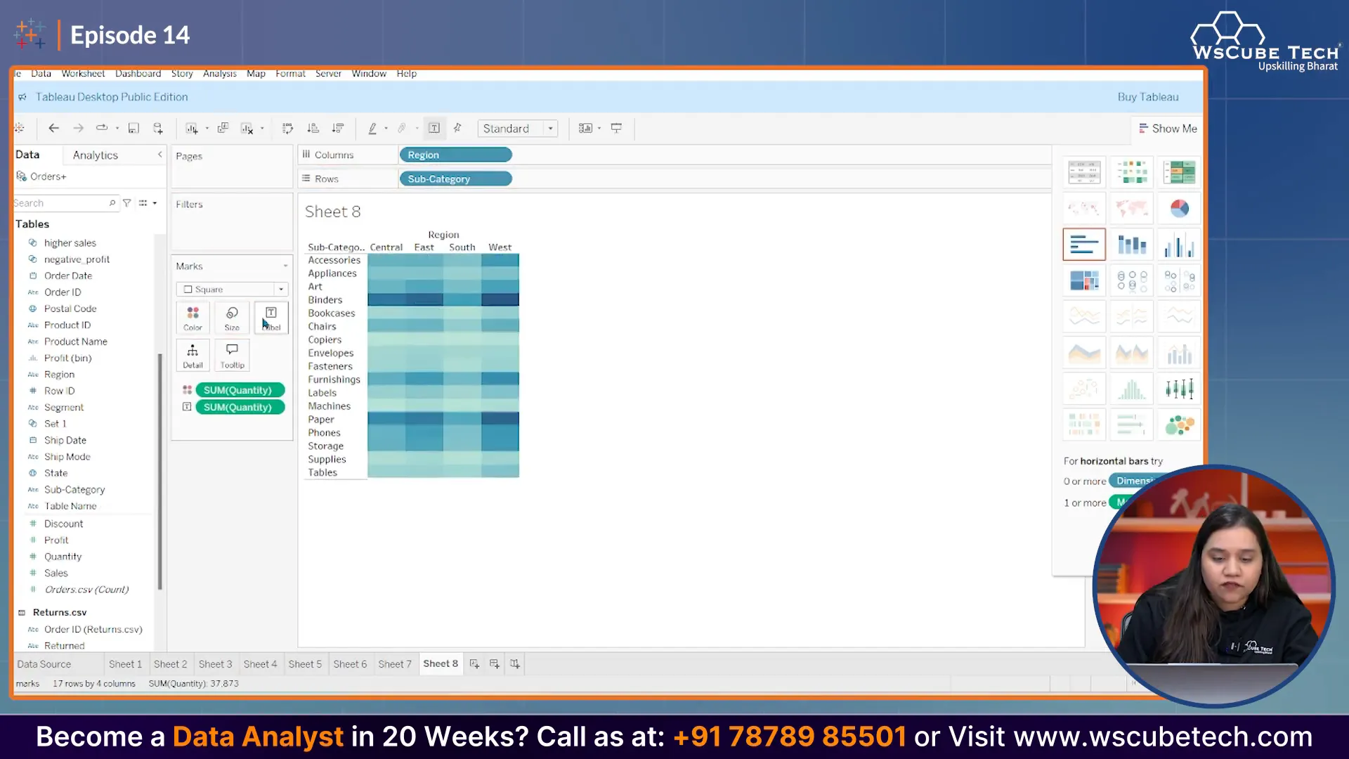
First, we need to drag the 'Category' field into the Rows shelf. Next, we will add the 'Region' field to the Columns shelf. This setup will allow us to see how different categories perform across various regions.
Step 2: Adding Sales Data
Now, let’s drop the 'Sales' field onto the main area of the sheet. This action will create a table that displays sales figures for each category and region combination.
Step 3: Transforming the Table into a Heatmap
To convert this table into a heatmap, select the option to create a heatmap from the visualization type menu. This will automatically apply color gradients to represent sales values, with higher sales shown in darker colors.
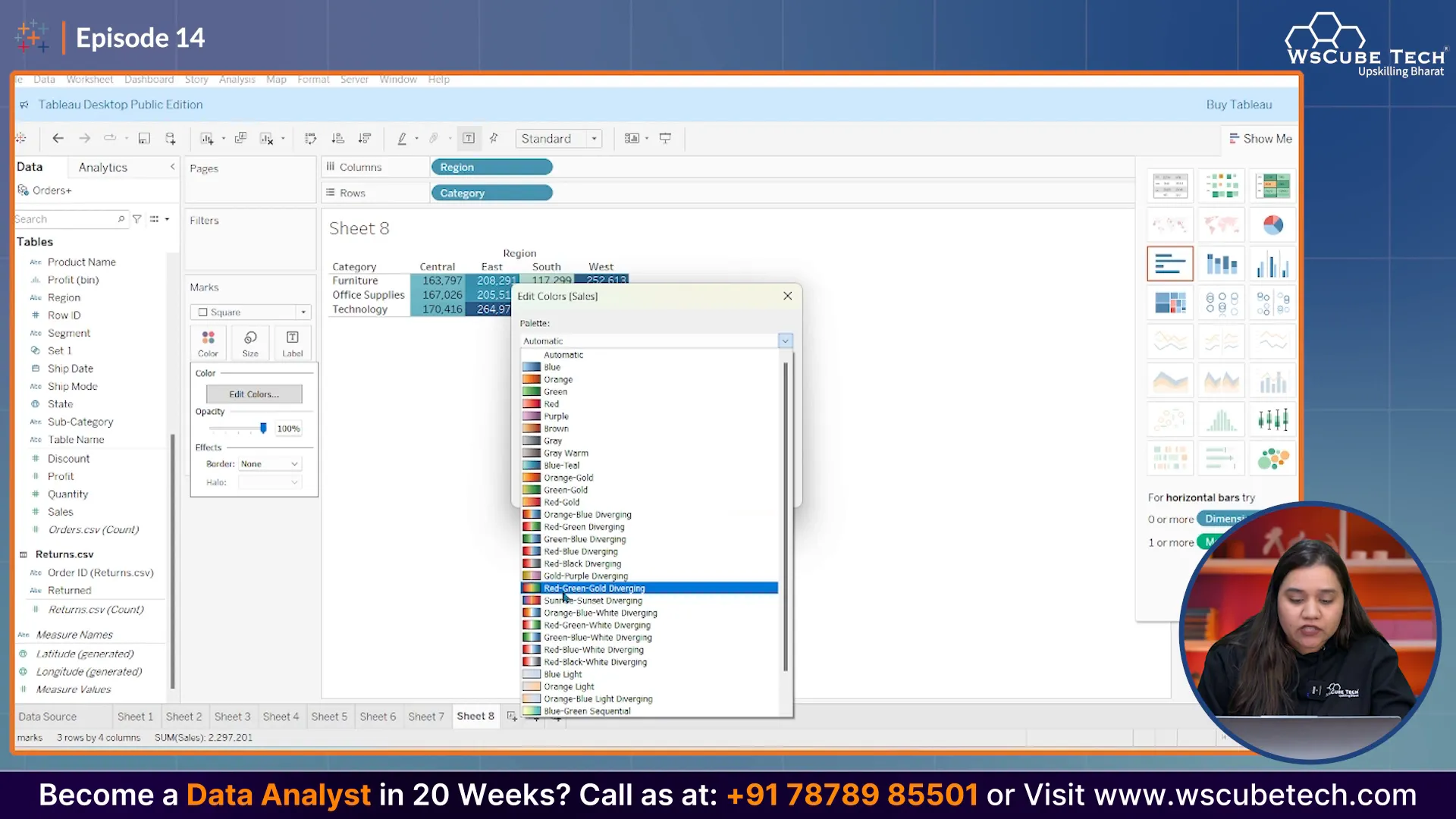
Step 4: Customizing Colors
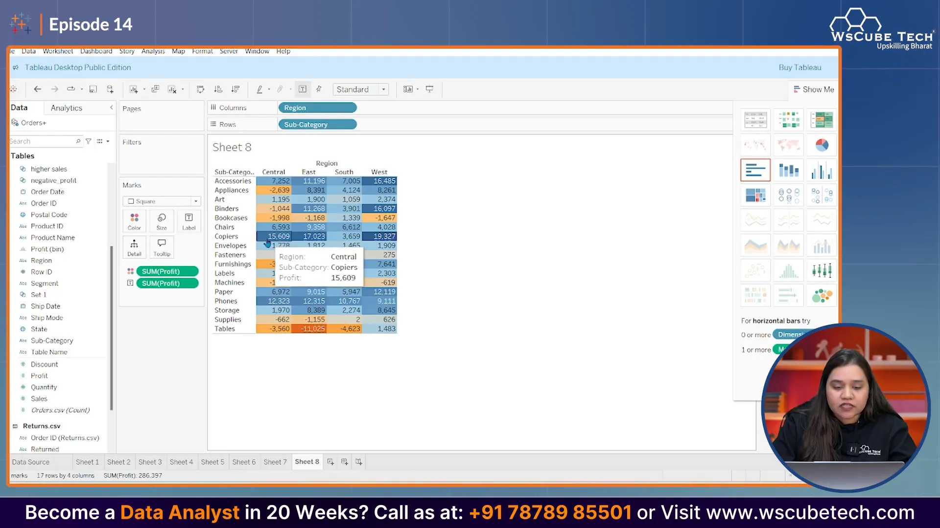
You can customize the color scheme to better reflect your data. For instance, you might want to use a gradient from red (for lower values) to green (for higher values). To do this, right-click on the color legend and select 'Edit Colors'. Choose your preferred color range and apply the changes.
Analyzing Your Heatmap
Once your heatmap is created, analyzing it becomes straightforward. Dark colors indicate high sales, while lighter colors represent lower sales. This visual representation allows you to quickly identify which regions and categories are performing well and which are not.
Advanced Heatmap Techniques
Heatmaps can also be enhanced by incorporating additional metrics. For example, besides sales, you can include 'Quantity of Orders' as a label on the heatmap. This addition provides more context to the data displayed.
Using Multiple Measures
To add even more depth, consider using multiple measures. For instance, you could display sales as colors while showing order quantity as labels. This combination provides a more comprehensive view of your data.
Identifying Patterns and Trends
Heatmaps are particularly useful in identifying patterns. For instance, if you notice that sales in the South region are consistently lower compared to other regions, you can investigate further to understand the underlying causes.
Conclusion
In summary, heatmaps are an invaluable tool for visualizing complex data in Tableau. They allow for quick identification of trends and relationships, making them essential for data analysts. By following the steps outlined in this guide, you can create effective heatmaps that provide deeper insights into your data.
Join Our Data Analytics Program
If you are excited about data analytics and want to learn more about tools like Tableau, consider joining our mentorship program. Gain hands-on experience and enhance your skills with guidance from industry experts.
Stay tuned for more insightful sessions and happy analyzing!
Made with VideoToBlog


0 Comments